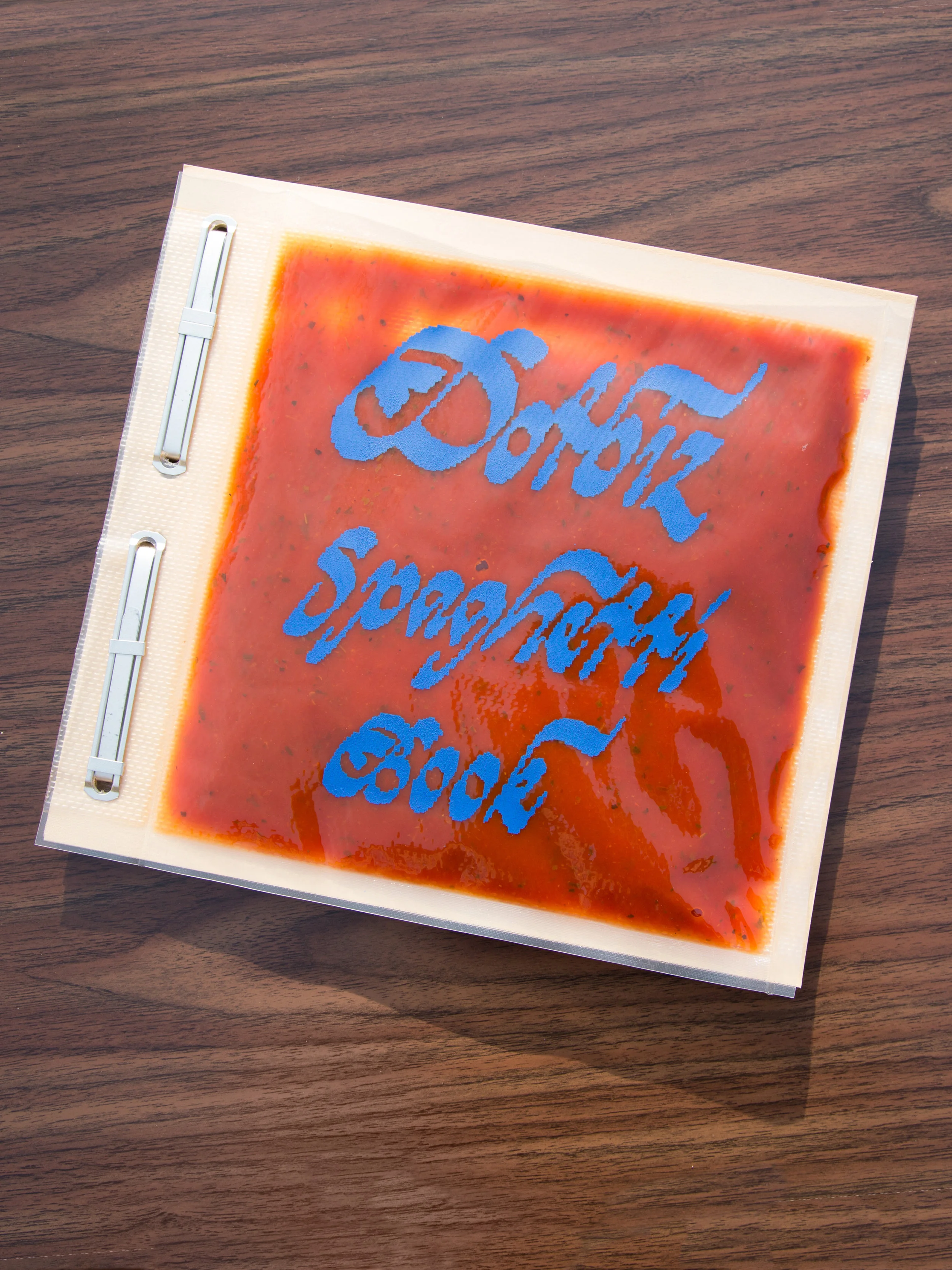
This edition of forty risograph books was produced with Helen Ip. Featuring screen printed vacuum sealed spaghetti sauce covers they were mailed internationally announcing the event Please Wait To Be Seated: Spaghetti Dinner Give Away.
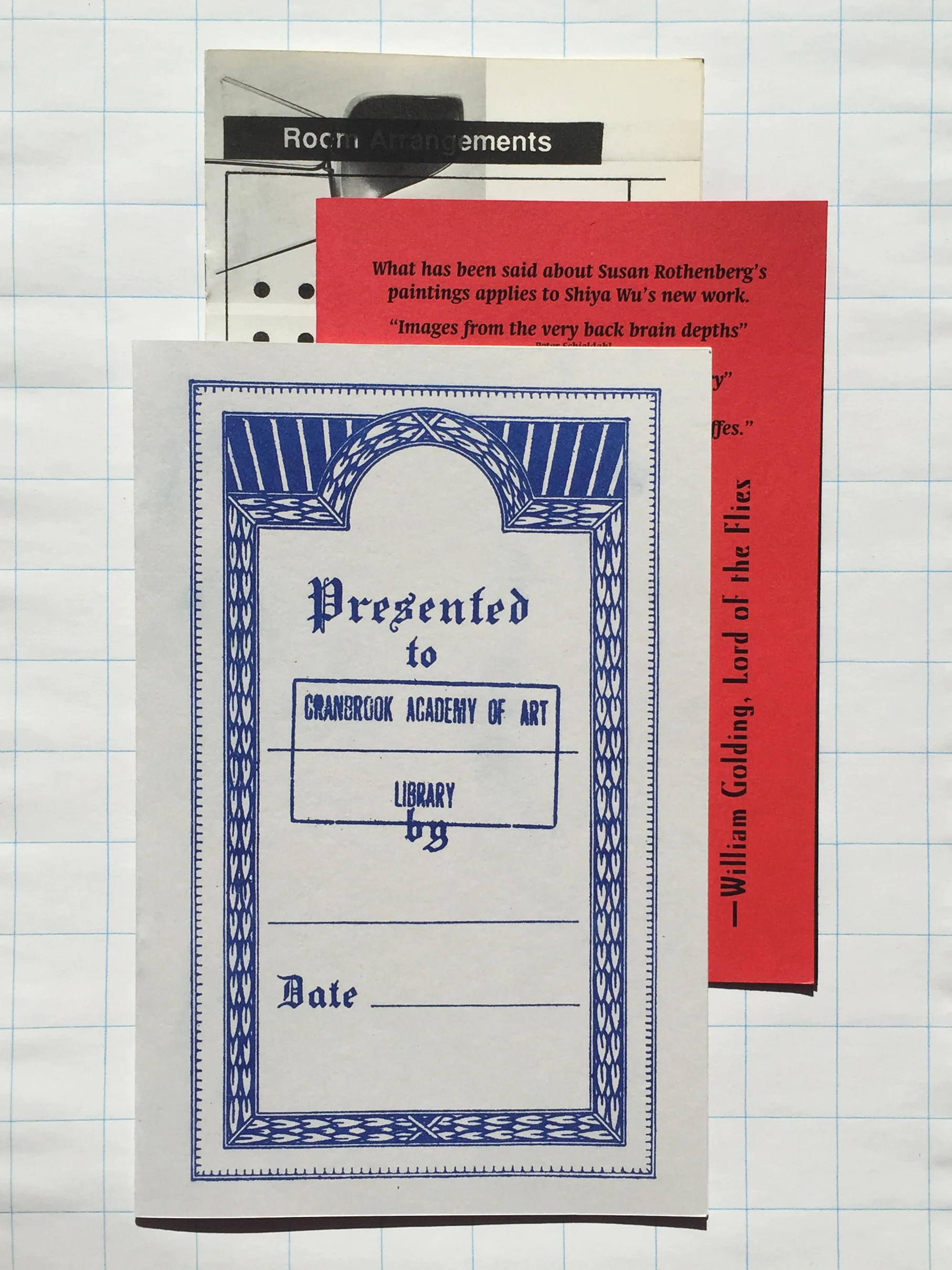
Printed using risograph, these reviews were each written and designed in a 48 hour period for Cranbrook 2D’s weekly critiques. They were produced in editions of 30.
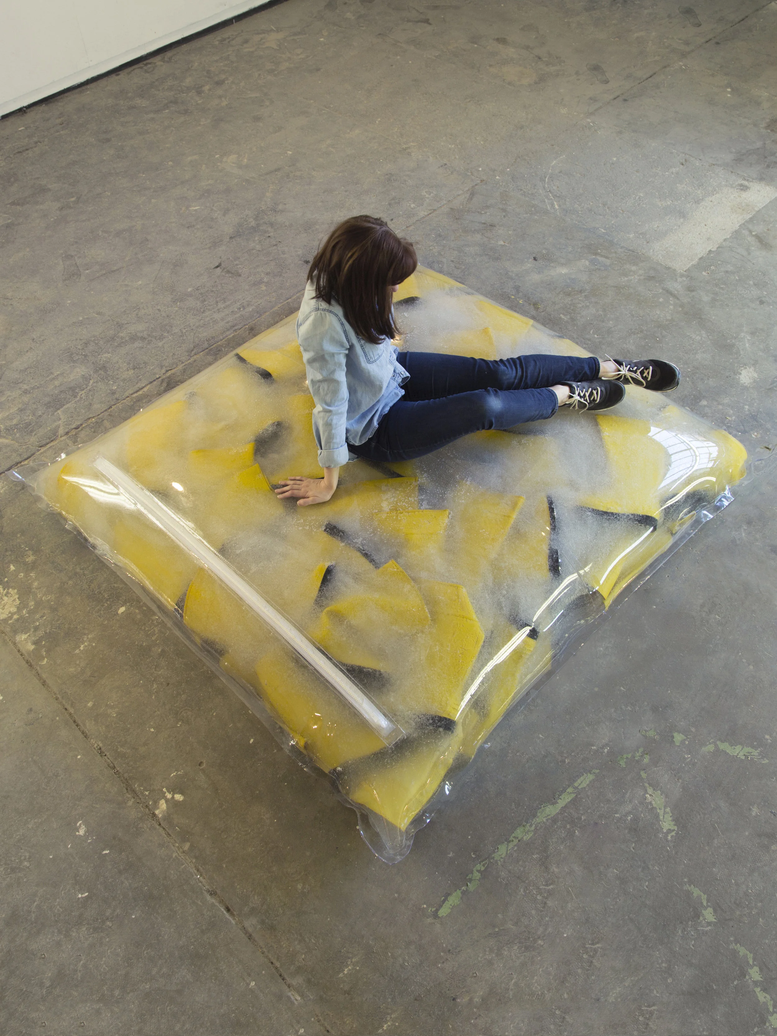
This project began when Helen Ip and I purchased 100 pairs of boots from a Salvation Army. The boots are stuck in super absorbent polymer that are contained within a 6’x6’ vinyl bag. The installation in total was a messy 10-hour ordeal. This object was designed as a functional place to sit but equally part of its functionality is the absurdity of the experience.

Consisting of twelve fabric formations and three vitrines, the production of this project consumed the collapsed Fabric Fortress that previously inhabited the room. Every roll was meticulously fitted together in order to create a self-supporting greater whole. Being present moment to moment, physically and mentally, on one task is inherent to a craft tradition—one that is particularly present in the weaving of textiles. In this tradition the quality, and therefore the value of the finished product, is derived directly from the skill and experience of the craftsperson. The industrialization of these processes moves away from valuing the skill of human labor, and instead places emphasis on efficiency. In this new paradigm, there is a transformation from craftsperson to assembly line worker. Thus human labor and human value becomes lost in the polish and uniformity, leading inevitably to the complete replacement of these “human components”.
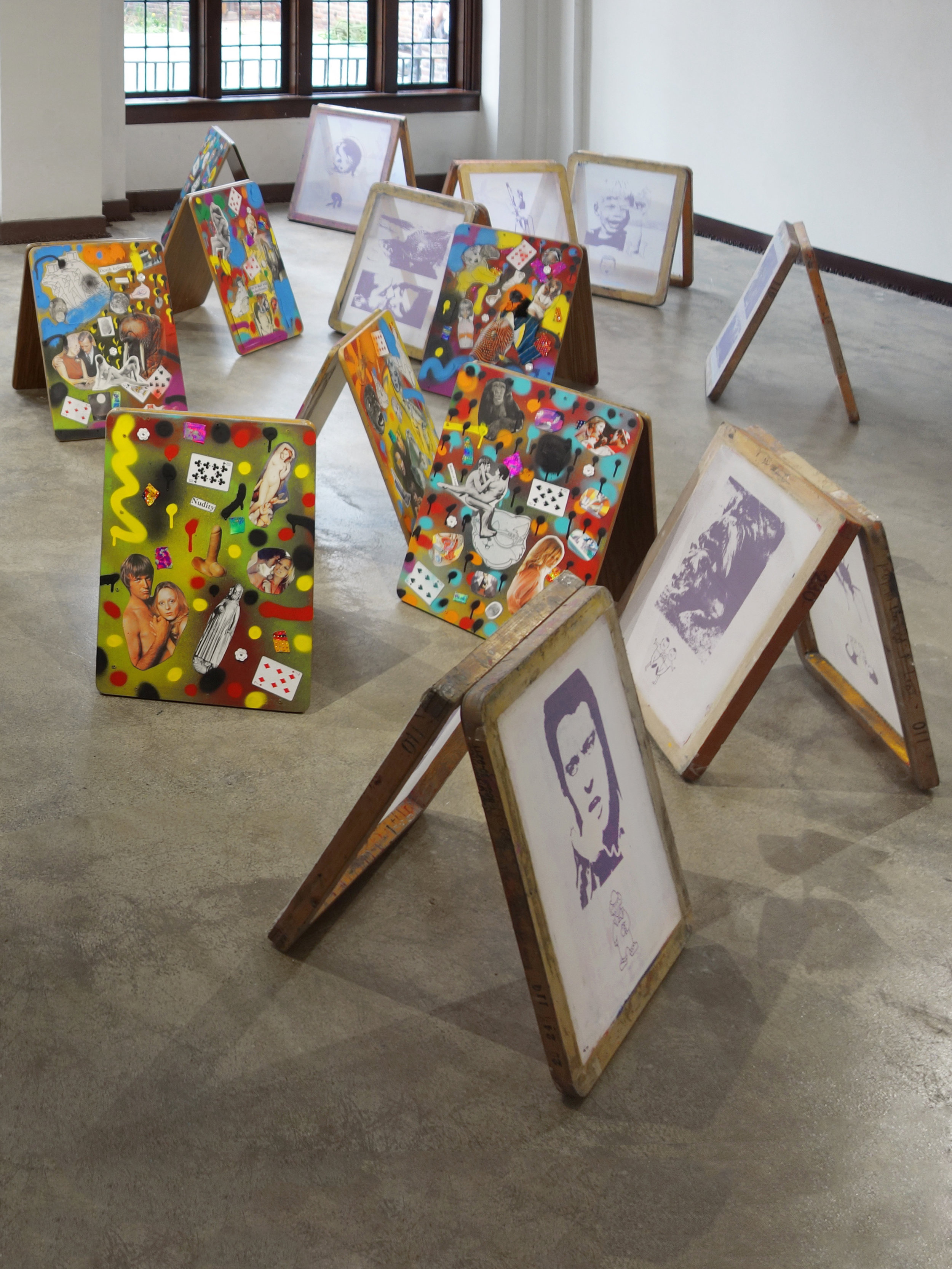
This collaborative project with Jenny Koehler uses twenty school desktops and twenty screen printing screens as surfaces for collage. Surrounding the installation and the viewer are twenty pounds of chocolate chips hidden along the baseboard causing the sweet smell of chocolate to hang in the air.
If you want to view paradise simply look around and view it.
—Willy Wonka
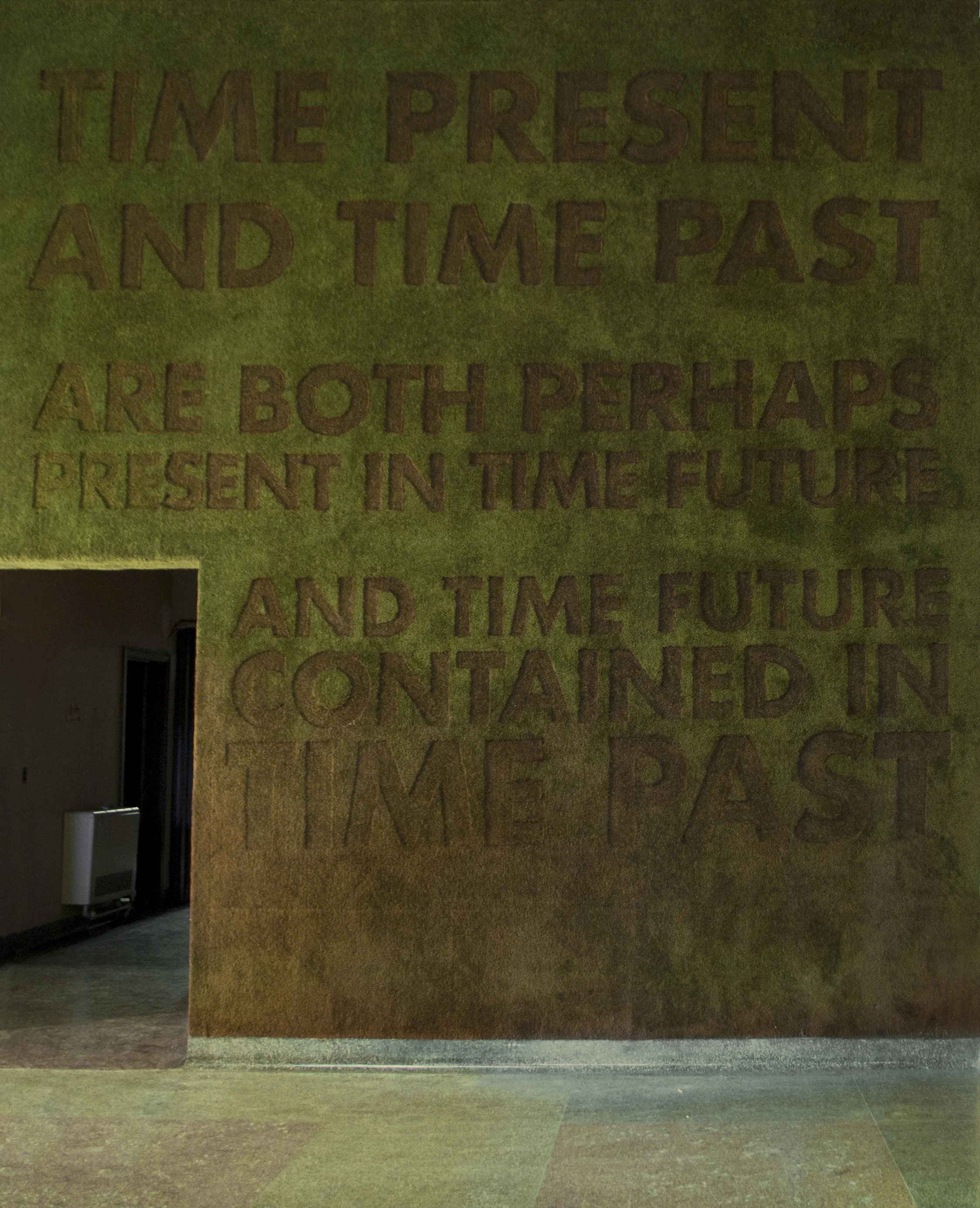
The project was created in collaboration with Kendall Konnect at the old public museum in Grand Rapids, Michigan. A T.S. Eliot quote was shaved into a sixteen-foot wall covered in pre-existing carpet using sheep shears. The quote was extracted from a publication celebrating the museum’s 150th anniversary.
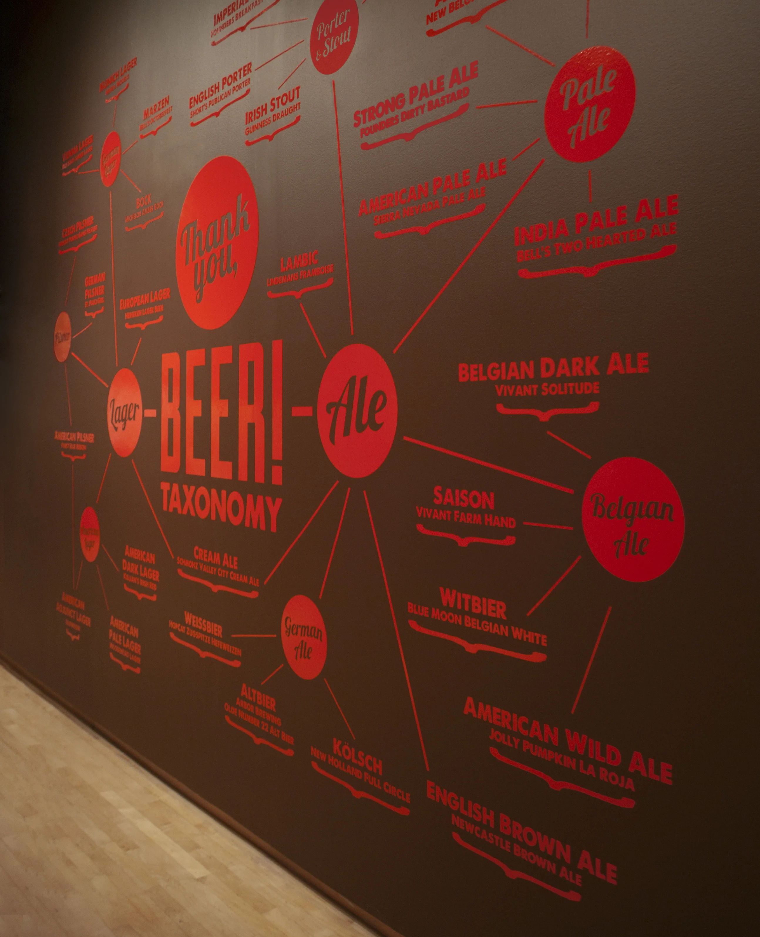
This Grand Rapids Public Museum exhibit was designed to celebrate the history of Grand Rapids brewing. The graphics were created within the brand guild lines for the exhibit. Data gathered by the museum curators was translated into easy to access informational graphics.
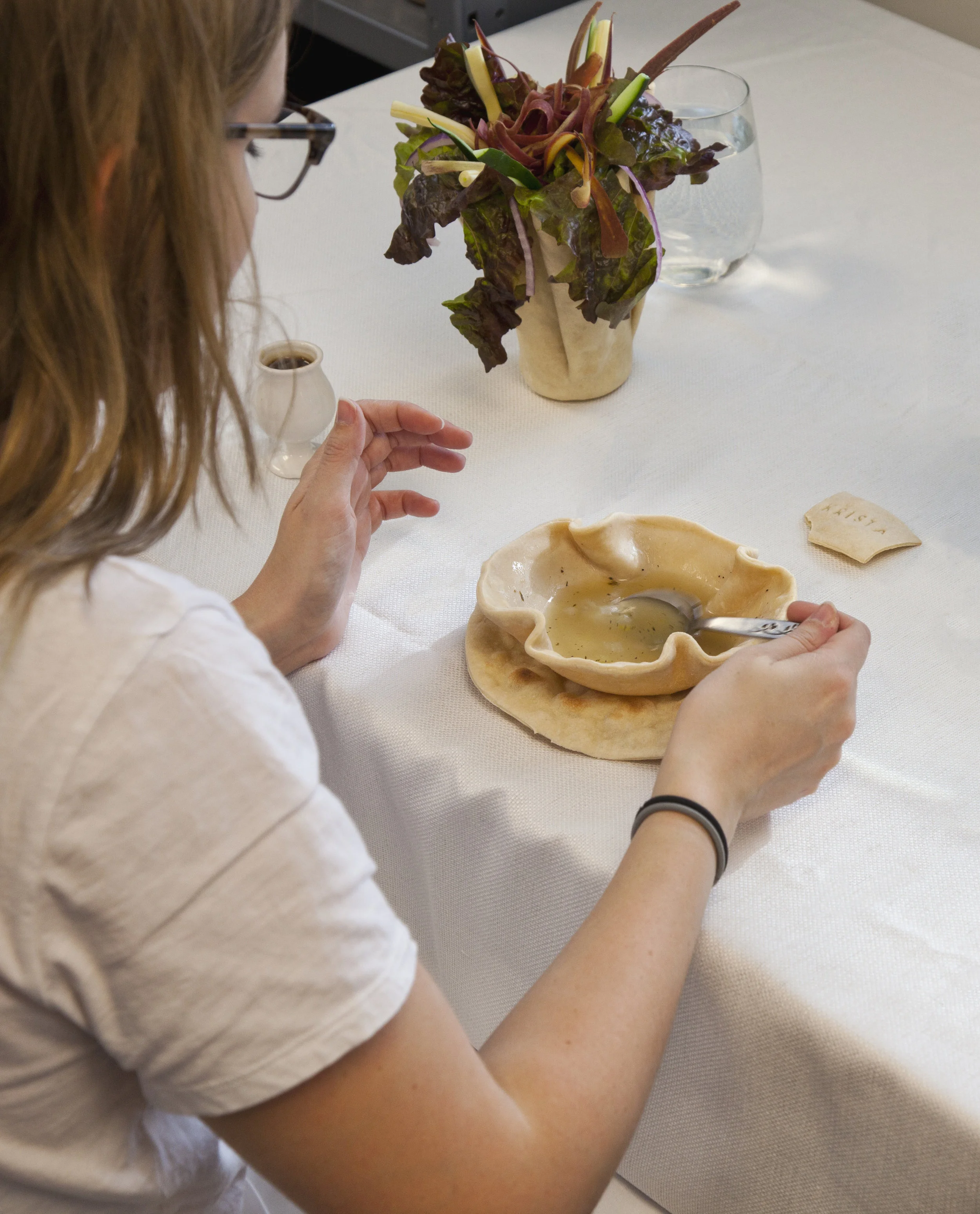
The kinkeeper holds the family together. She is a store of knowledge written through experience. Twenty people, over two nights, were invited to attend a dinner party in the Cranbrook Academy Library. The invitations, bowls, plates, and soup noodles were made from the same dough. This project was a collaboration with Nicole Dyar.
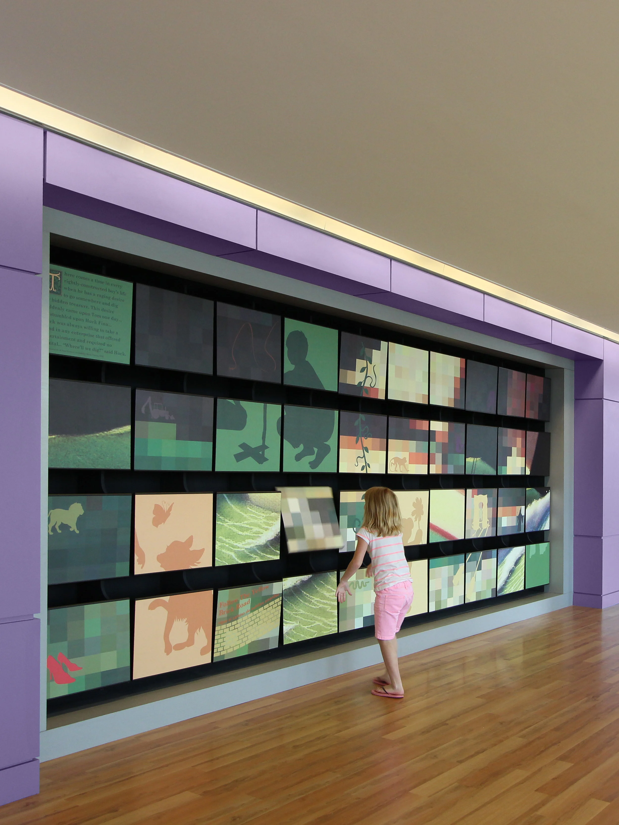
Interactive storytelling walls were created in the lobbies of the UVA Children’s Hospital that all revolve around major themes in children’s literature. The interactive walls have panels that rotate to reveal pieces of a larger image.
In the treatment rooms I-spy illustrations were created using icons to form characters from a selection of children’s book. An excerpt accompanied each illustration from that story. These I-spy illustrations are meant to serve as a positive distraction in the treatment rooms and to also encourage children to read.
This project was completed at Stanley Beaman & Sears.
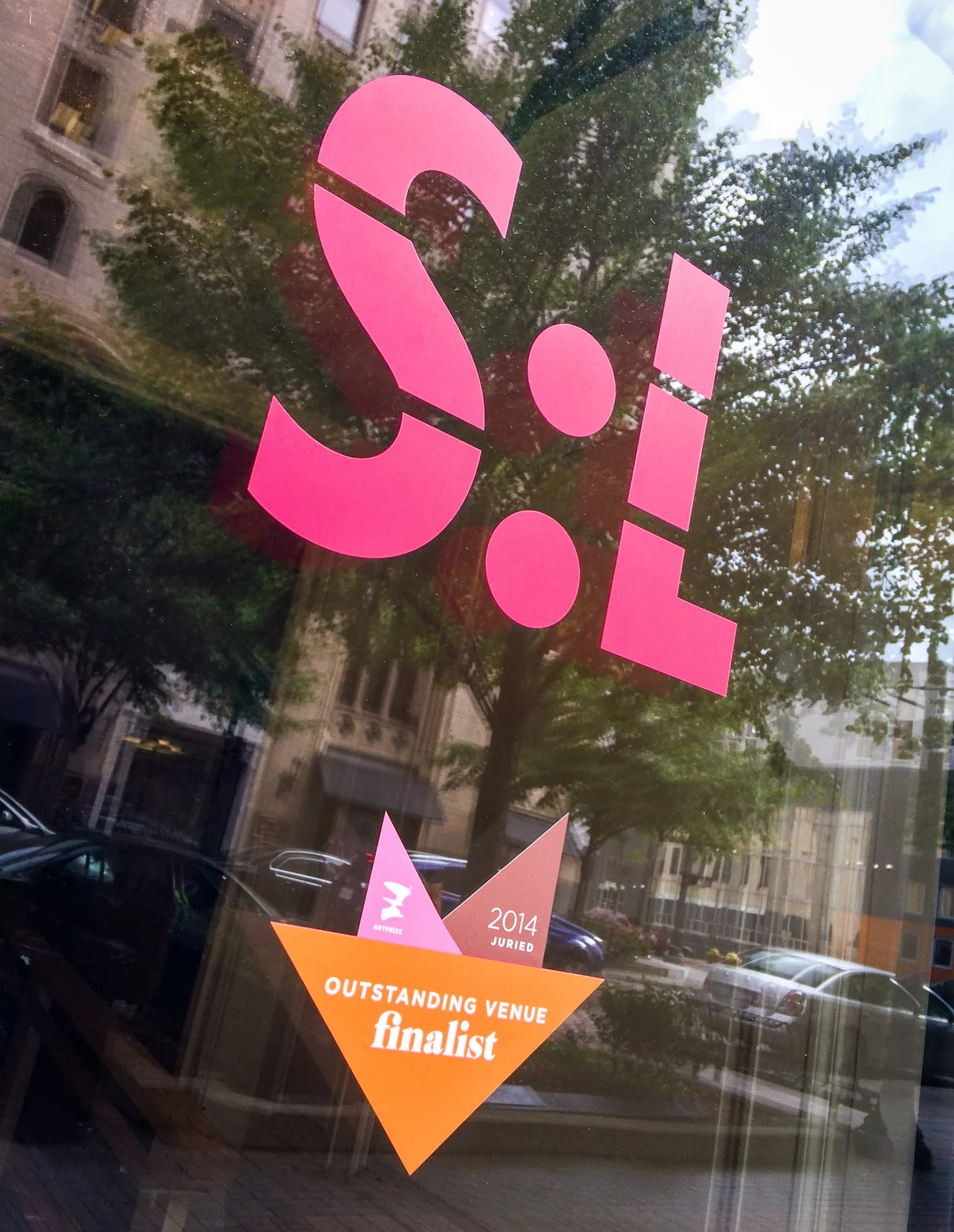
Branding and wayfinding were created for SiTE:LAB’s 2014 Art Prize exhibition. The month long event featured local and international artist installations in the vacant Morton Hotel and Old Kent Bank. It was important to maintain the brand recognition of the existing SiTE:LAB logo while also making it specific to the Art Prize event. The event name, SiTE:LAB @ The Morton was chosen to provided context for the location and history of the building. The logo is segmented into thirds, representing the three floors of the building. Pink was chosen for the branding and signage so that it would stand out to visitors in the neutral space and help them navigate the complex building. Over the course of the event over 50,000 people toured the exhibit and it won the Juried Award for Most Outstanding Venue.
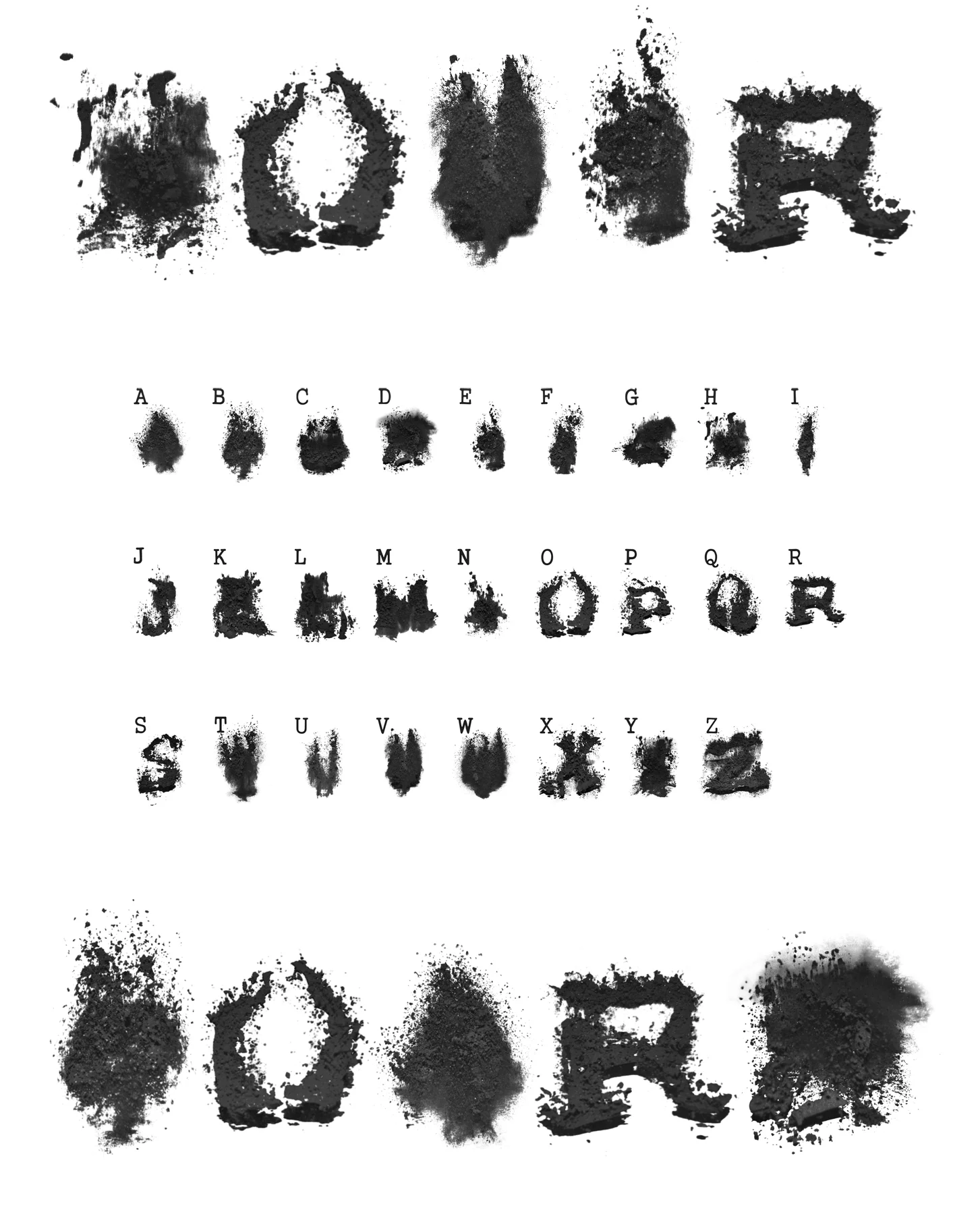
This display typeface was created through an exploration of hoverboards. It examines surface and the speed of communication. The typeface was created by capturing an image of graphite powder as it was suspended in the air.
D0TBIZ takes an expansionist approach to resources by instituting a free artist’s residency inside Cranbrook Academy of Art. We are the evidence of a raw egg oozing through a cheese grater.
HOME DAILY
THAT’S THE WAY IT FEELS TO ME
IN BY 9:30, OUT BY 3:30
D0TBIZ: taking the “GOTCHA!” out of institutional critique
d0t.biz